Sunbelt Rentals: SmartEquip iOS Application
Introduction
Role
-
UX Research
-
UX Design
-
Visual Design
Tools
-
Figma
-
Sketch
-
Adobe CS
-
Marvel
-
Style Guide
-
Sketch Pad
Deliverables
-
User Research
-
UX Documentation
-
Wireframes
-
High Fidelity Mockups
-
Prototype
-
Presentation
Duration
-
1 Week
The Problem
SUNBELT RENTALS
Sunbelt Rentals rents a variety of equipment especially for the construction industry. There are several internal applications that help them keep up with their rentals. The equipment must be frequently maintained and often requires mechanics to travel to the customer’s location in order to resolve any equipment breakdowns.
THE CLIENT
"SmartEquip is a parts procurement and equipment lifecycle software which helps Sunbelt with it’s equipment maintainance. SmartEquip developed a solution which eliminated the need for the paper form and emailed images. However, they needed a designer to help redesign their UI and UX flow to increase usability and field adoption."
THE USERS
"I spend a lot of time taking photos of equipment when working on breakdowns. Then I have to attach them all to an email I send to my manager. I fill out my record form on paper, then on our Wynne system and again on the mobile app. I don’t really trust our current photo capture."
The Solution
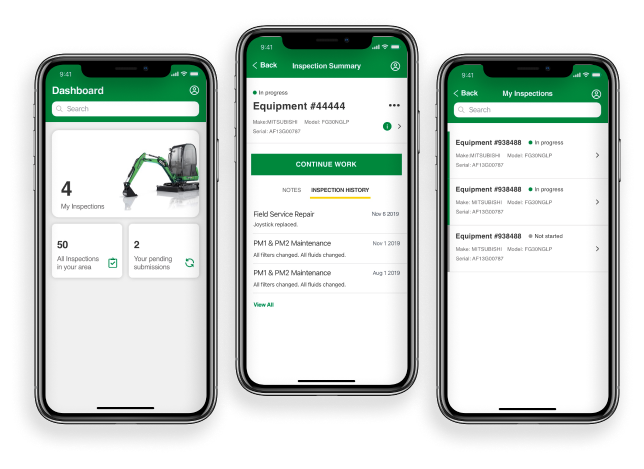
SmartEquip was redesigned to follow the human interface guidelines, human computer interaction fundamentals, and the Sunbelt Rentals style guide. I also eliminated custom, unconventional icons and added icons that aided in the understanding of the tasks.
Discovery
USER FIELD INTERVIEWS
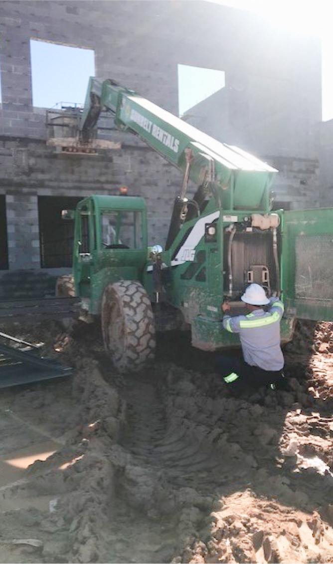
In order to learn their workflow as quickly as possible, I scheduled a day long ‘Ride-Along’ where I rode in Tod’s service vehicle as we went to customer locations in the area to fix equipment. I got to see his normal workflow and the challenges he encounters.
When it was time for lunch, we hit one of his usual spots, Waffle House. Even during this time, I got to see how he changed his status to ‘On Lunch’. Followed by a looming countdown on his phone which he placed at the center of the table while we ate.
- There are many photos captured throughout the process to document the before, after, the hour meter, the paper documents, the part conditions, and all angles of the equipment.
- Documenting their work and transferring it to two different applications sometimes took longer than the actual work of fixing the equipment.
- They spend most of their time troubleshooting equipment failures. They need quick access to this equipment history as well as equipment specifications.
Information Architecture
WIREFRAMES
To begin my 1 week redesign of SmartEquip, I started sketching out possible solutions and improvements.
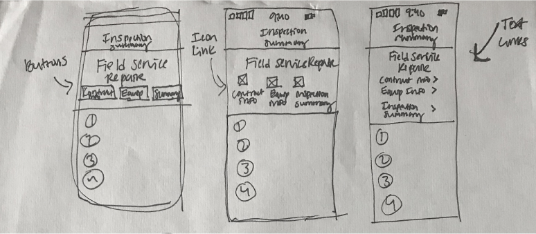
After ideating and brainstorming with my sketches, I went straight to high fidelity mockups. I referenced the pilot SmartEquip iOS application on my phone, my research, my sketches, and the Sunbelt style guide in order to begin my iterations of visual mockups.
Visual Design
HIGH FIDELITY MOCKUPS
While putting together the visual designs, I continued to improve the user flows using what I had learned during my field research. See some of the main changes I made along the way.
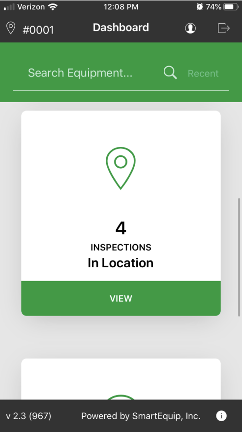
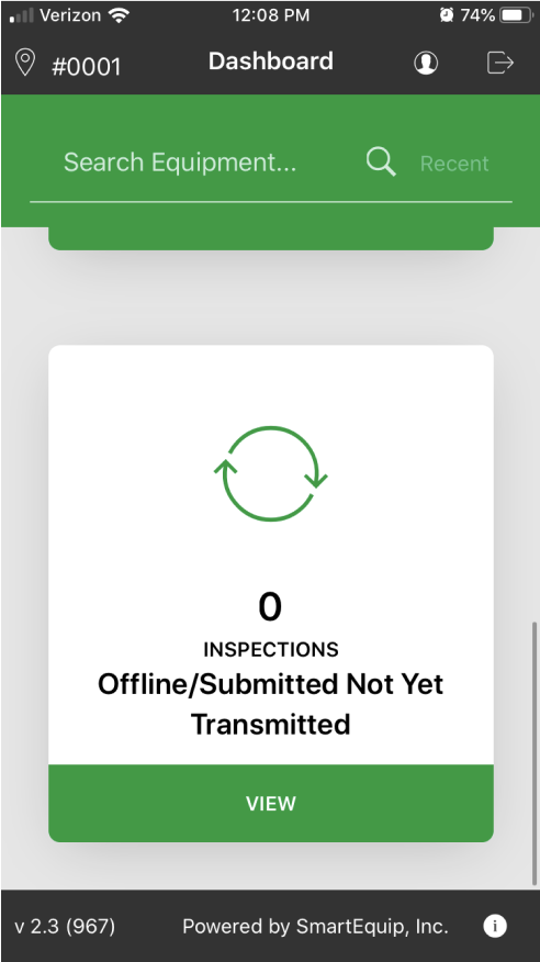
Dashboard: Before and After
Before: Dashboard
Before: Dashboard Scroll 1
Before: Dashboard Scroll 2
After: Dashboard
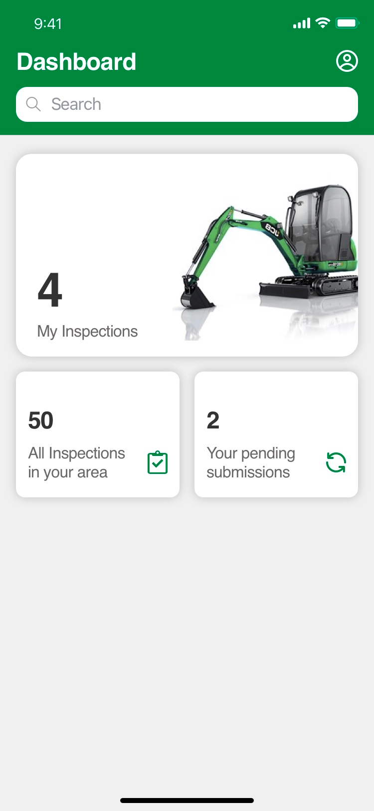
After: Menu

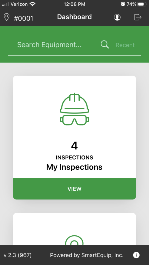
- The language used for ‘Inspections In Location’ wasn’t clear for the user because in location actually meant all inspections in the area being done by other field technicians.
- The offline/submitted not yet transferred section was also unclear and a bit lengthy in its wording.
- The user could not see all of the options without scrolling three times down the dashboard.
- The app version number was taking up a lot of space and could be located within the profile portion of the app. The logout function was also placed within the profile navigation.
My Inspections Screen: Before and After
Before: My Inspections
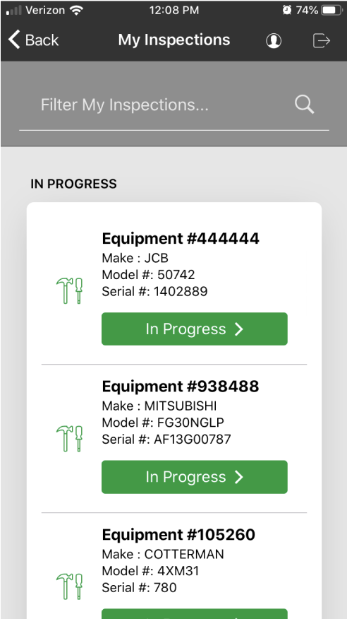
After: My Inspections
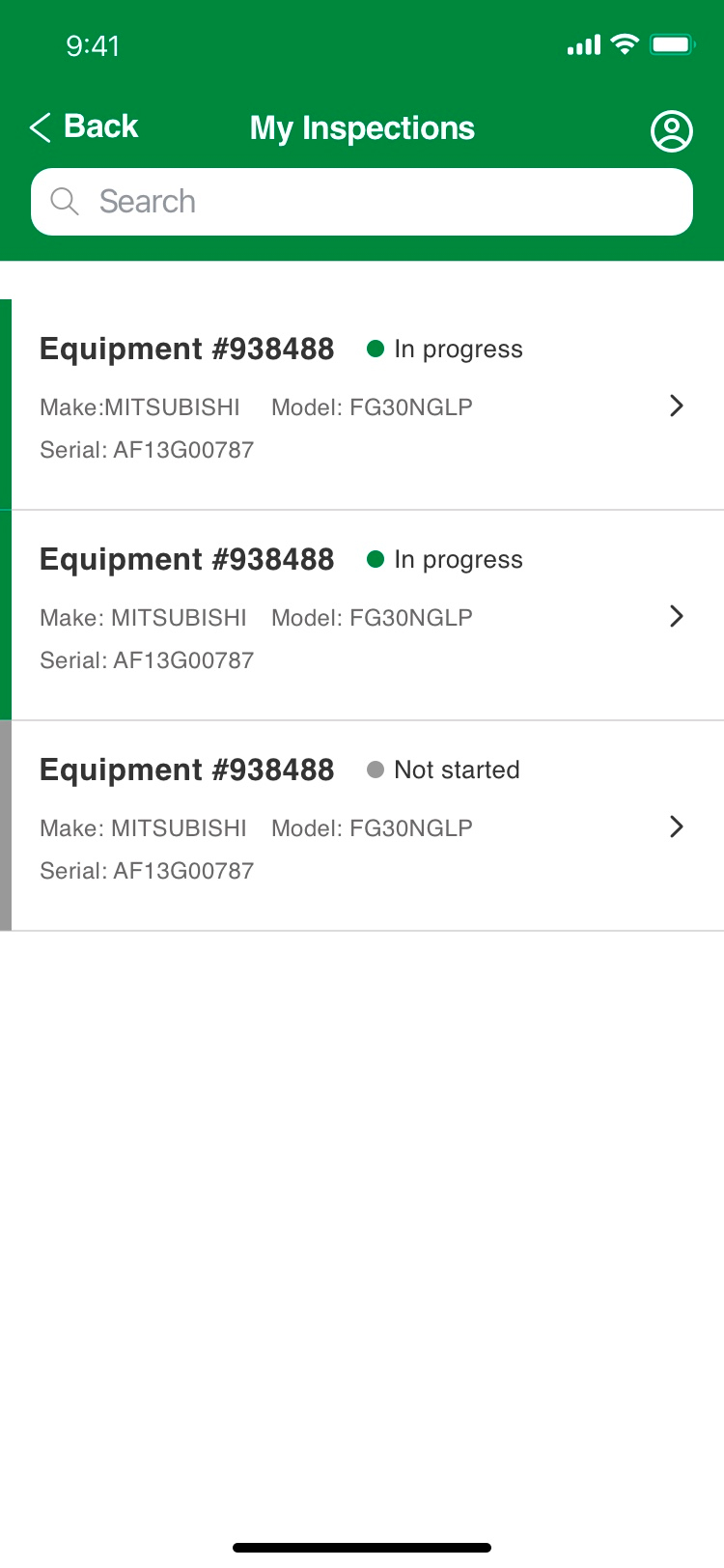
- I removed conventional icons that weren’t contributing to the users’ understanding of the task.
- I expanded the width of all screens to allow for important content.
- I utilized the iOS Human Interface Guidelines to show a list format for the inspections and gave priority to the status of the individual inspection.
- I carried over a ‘New’ label that was being used on another internal application. Users were familiar with this pattern so it would aid in them knowing what had been added to their list since they last looked.
Inspection Summary: Before and After
Before: Inspection Summary
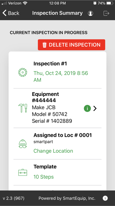
Before: Continued Scroll 1
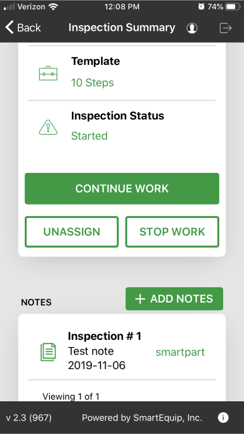
Before: Continued Scroll 2
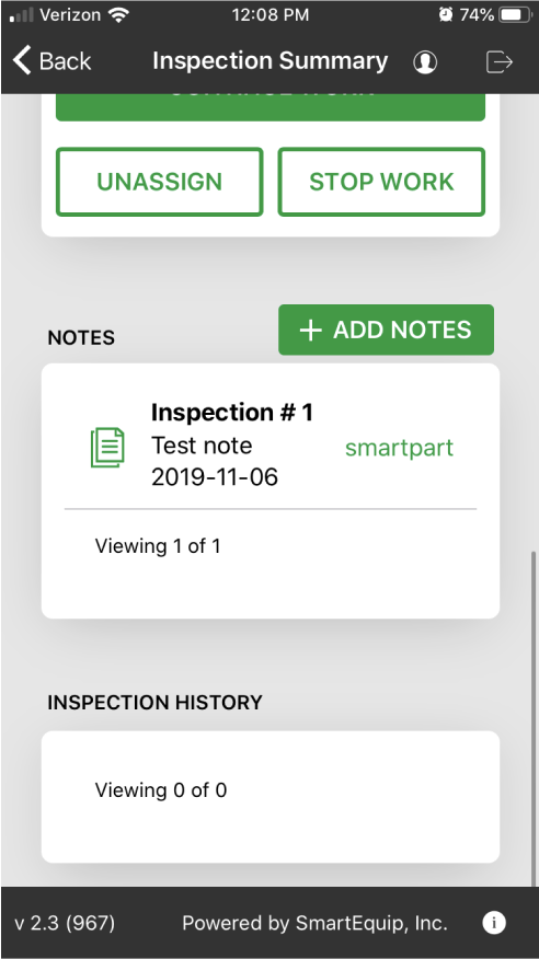
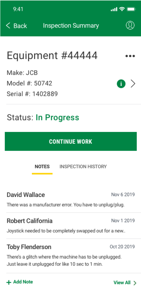
After: Inspection Summary
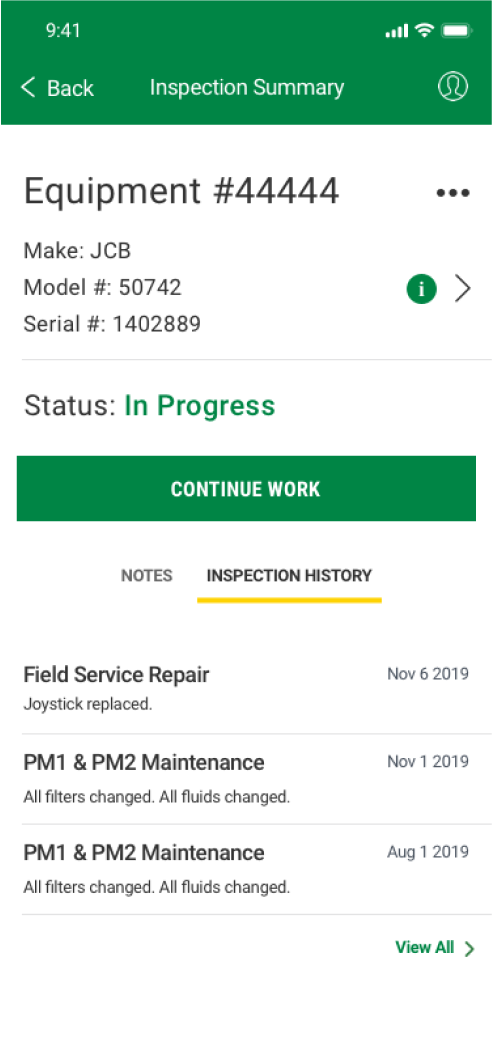
After: Inspection History
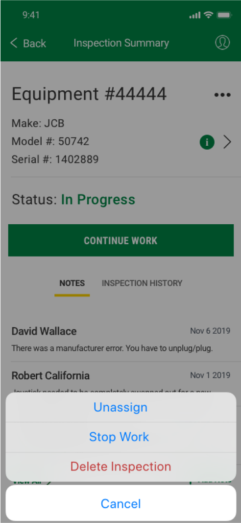
After: New Menu
- Again, I removed the icongraphy and expanded the width of the screen. This allowed for the entire inspection summary to show in one view without scrolling. It also moved the main call to action up higher so the user didn’t have to scroll.
- I removed the ‘Change Loc’ functionality because the service technicians would not be using this functionality. It would be up to service manager to make this decision.
- I removed the Template section since this isn’t information that the user needs to know. This would be used by the engineers.
- I moved the secondary functionality into a menu containing the ‘Unassign’, ‘Stop Work’, and ‘Delete Inspection’. The delete inspection action was originally placed as the first action on the page. These functions would not be used very often.
Inspection Form: Before and After
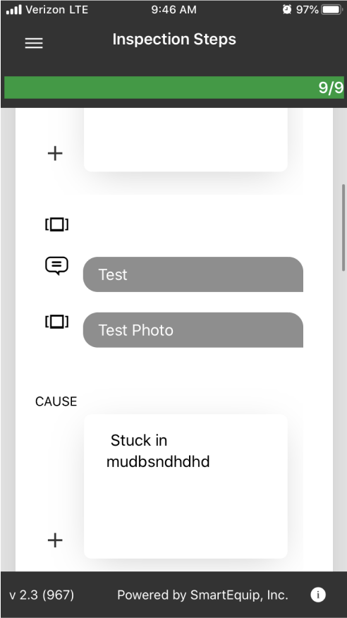
Before: Inspection
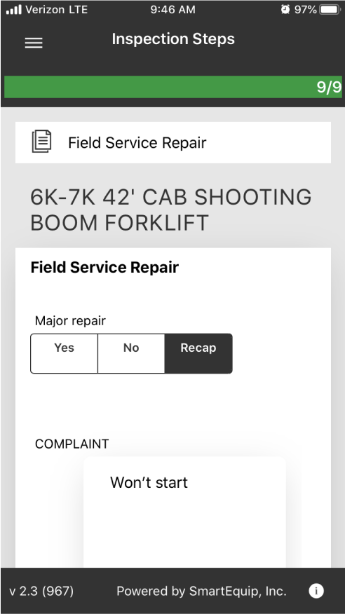
Before: Inspection Menu
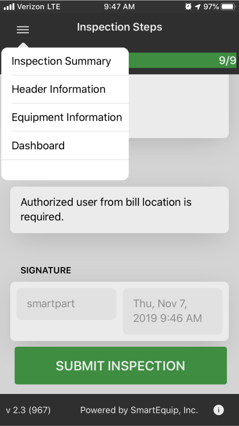
Before: Comments & Images
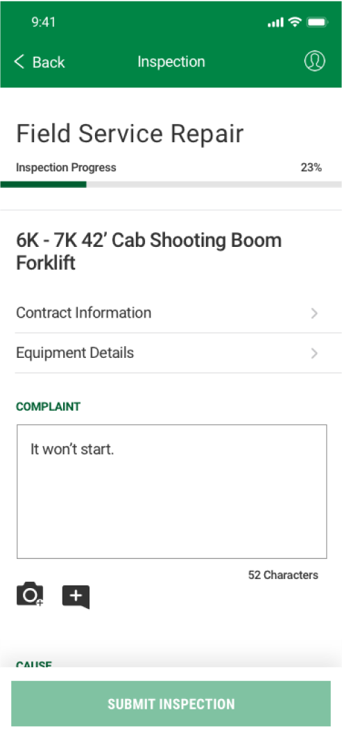
After: Inspection
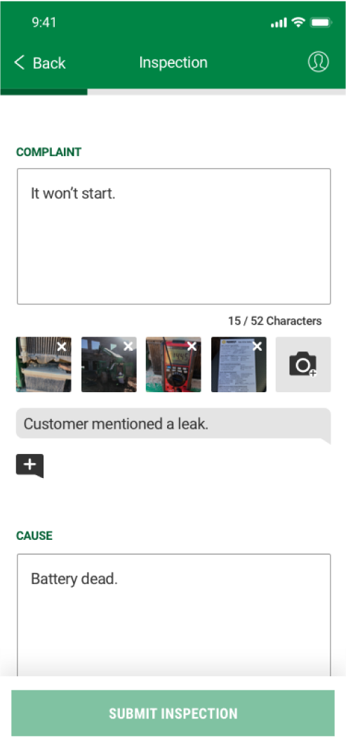
After: Comments & Images
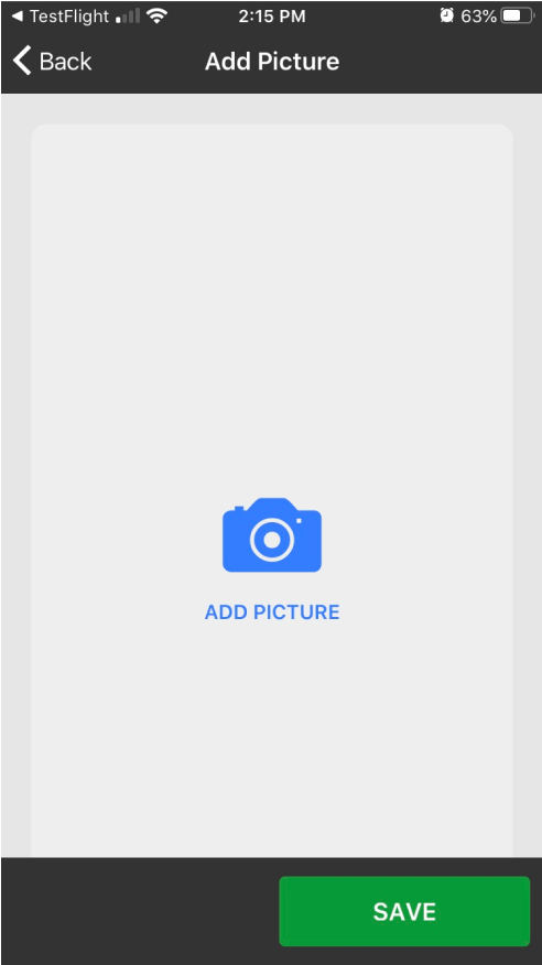
Before: Add an Image
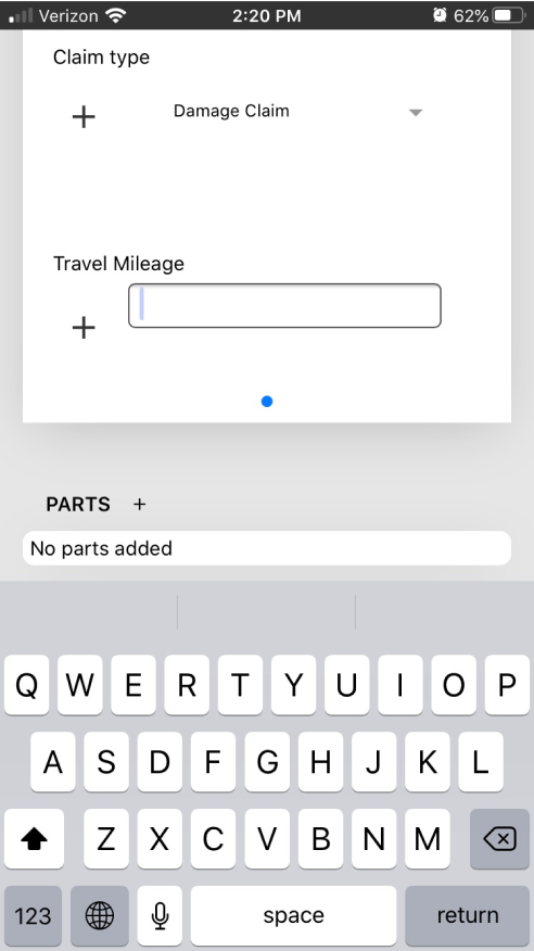
Before: Travel Mileage
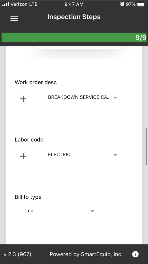
Before: Dropdown Selection
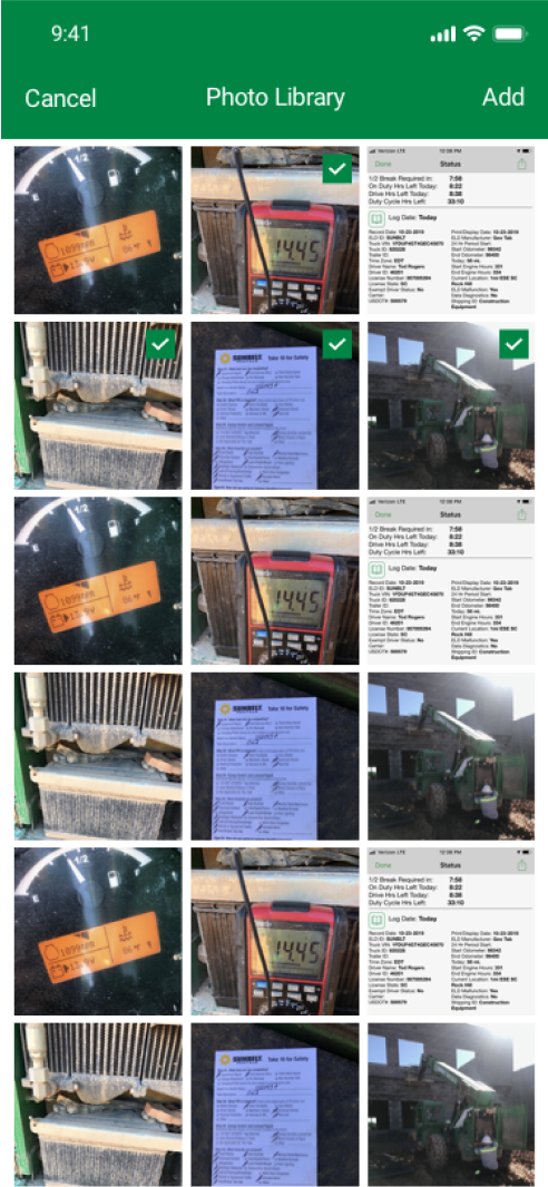
After: Photo Selection
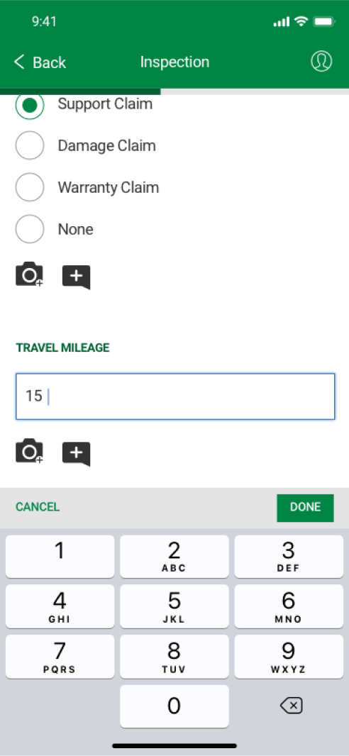
After: Travel Mileage
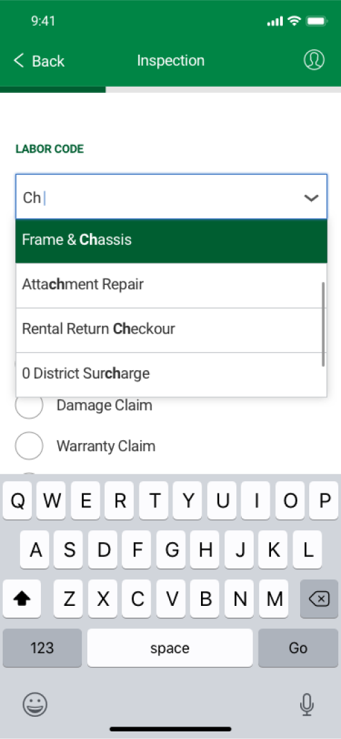
After: Dropdown Selection
- The menu was pulled out into the main inspection form so users could easily access this important information. I also renamed ‘Header Information’ to ‘Contract Information’ which is the title service technicians use.
- Previously when a user added an image, an icon would appear and they would have no way to edit or see if they were successful. I added in a thumbnail and the ability to delete an image they’ve added.
- Previously it took several steps to add one image. When riding along with technicians, I saw them take at least 50 - 75 photos. I redesigned this feature to allow them to select multiple photos at one time from their camera roll.
- In cases where users were inputing only a number (See Travel Mileage), I incorporated a numerical keyboard.
- For selections with only a few options, I changed it from a dropdown to a radio selection. For selections with many options, I incorporated a search with a dropdown.
Post Launch Improvement
While gathering feedback from the field, we determined that there was a need to add parts to the field service record form. These are parts they used during the repair of the equipment. Previously there was only the ability to order/find a part, but we needed to add in the pathway for adding a part that was in their truck inventory or from the company part store.
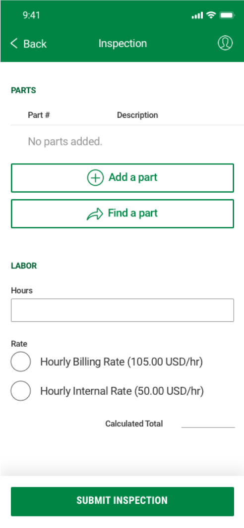
Parts section of the inspection
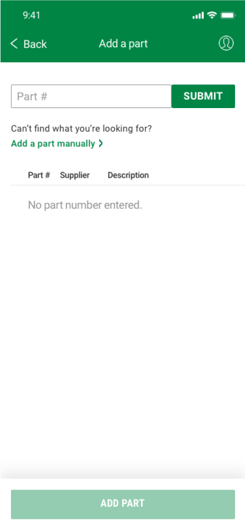
Add a part screen
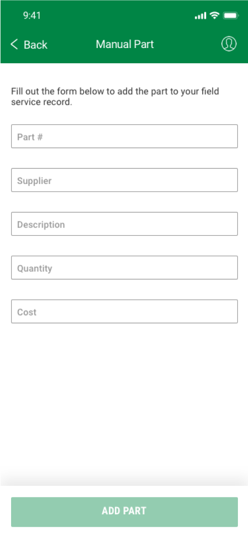
Manually add a part
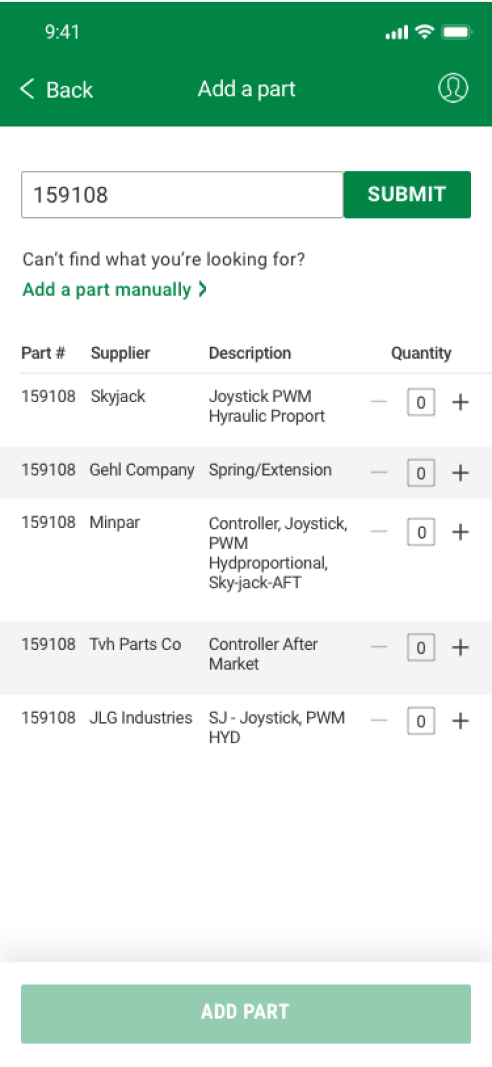
Part search results
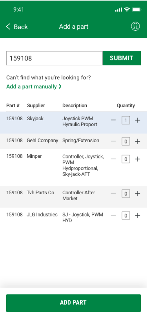
Part Selection
Part added
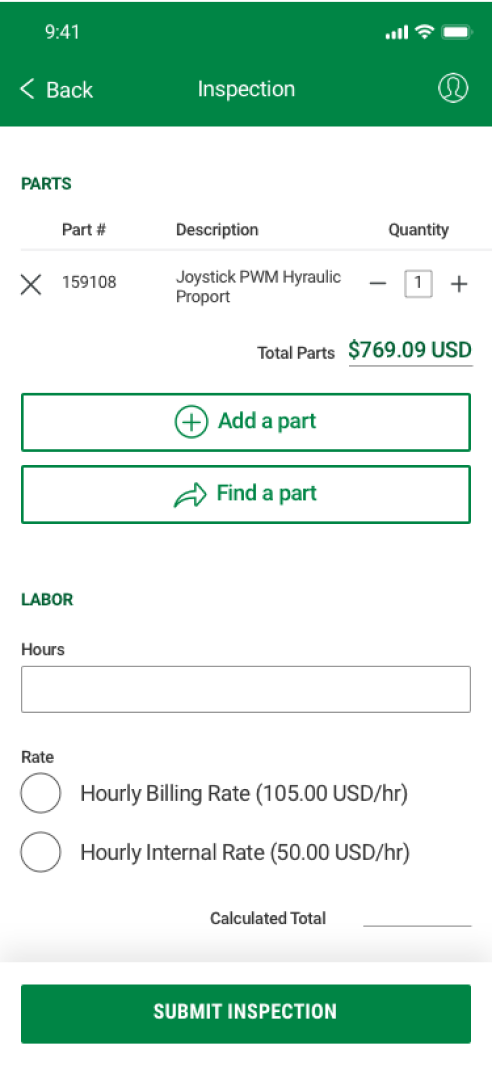
- Users are presented with two pathways of either finding a part or adding a part that they’ve already used from the store or their truck.
- When adding a part, the user can either search by part number or add it manually if their part can’t be found or doesn’t exist in the database.
- When discussing with development, we determined there wasn’t enough time for a live search capability. Therefore, I designed a ‘Submit’ button that signaled the need for a full number entry. The error state also notifies the user that an entire part number must be entered into the field.
- For the displayed results, I utilized a table that would allow them to adjust the quantity. I excluded information such as the ‘Stock Class’ which the user would not be familiar with and included what information they would need to find what they are looking for.
- Finally, when the part is added, they still have the ability to adjust quantity and delete the part from their form. The total cost is clear so they can compare it to their invoice or truck inventory form.
Reflections
- When starting this project I had no idea what a service technician really did with their day. I knew I had to spend some time seeing them in action before I could get started with any of my designs. Seeing how effective this was in contributing to successful design decisions, I’ve since carried this over to any other product I work on. Even before any sort of planned user research, I’ve found it most helpful to observe and spend time with the user.
- This was my first opportunity to shift a culture towards UX Design . My first meeting for this redesign started with the group asking: “So why do we need UX Design, what is it?”. A month later, after the redesign, they came to me to design a new feature, knowing now that this is a crucial first step in the development of their product. Now their concerns and questions are starting to reflect their new knowledge of best practices and it’s really exciting to see the transformation. I’ve always enjoyed design, but I never knew how much I would love influencing a culture and teaching others.
- Since the deadline was tight, I had to produce my designs and make decisions very quickly. Given more time I could have explored better options and done usability testing with the service technicians to verify my designs. As they introduce my designs to the field during pilot, I will be able to make adjustments for users to continue my improvements.